June 5th, 2010
It’s amazing how far mobile plans have come thanks to competition, technology and changes in our usage patterns. After examining my monthly bills for the past year, I noticed that my actual voice usage dropped to a paltry average of less than 200 minutes a month. It wasn’t long ago that I needed at least 1000 minutes to cover my needs. However, that’s all changed and use much less voice now and my text and data usage has increased exponentially. My current plan didn’t reflect my usage patterns so I decided to change it. As a result I’m saving over $20/month which is fantastic.
So, here’s a breakdown of the change:
1000 Minutes (+ Nights/Weekends) -> 500 Minutes (+ Nights/Weekends)
1000 Text -> Unlimited Text
Unlimited Data -> Unlimited Data
Month-To-Month -> Month-To-Month
T-Mobile Hotspot -> No T-Mobile Hotspot
So, I’m losing the T-Mobile Hotspot service which is ok since most Starbucks no longer support it anymore and I’m traveling less now. Also, since I can tether my laptop to my phone it’s not as important as before. So, overall I’m pretty happy to be saving $20 a month and even better was that I didn’t have to sign up for any sort of 2-year agreement. It’s this great customer service that’s kept me a customer for the last seven years.
I’m also glad that T-Mobile’s data plans actually make sense unlike AT&T’s newest data plans which are ridiculous. I think they they make some sense for casual use but with the latest smartphones encouraging more data usage, the plans are a worse deal for their customers. T-Mobile’s rule is truly unlimited with the fastest speeds up to 5GB per month and with slower connection speeds should you go over that limit. There’s no extra charge. Of course, T-Mobile has to do this as one of the smaller carriers but at least they’re giving their customers incentive to stay on the network. I actually like that they’re smaller. I don’t drop calls. 
At any rate, I suggest that people check their plans from time-to-time to see if they’re matching up with their usage. You might find that there are some hidden savings.
May 14th, 2010

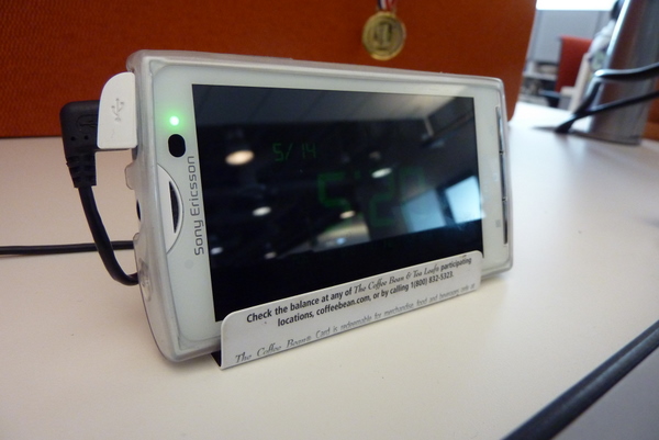
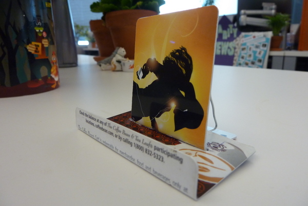
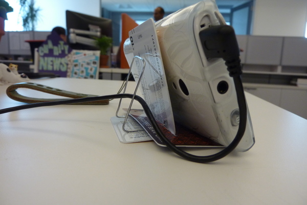
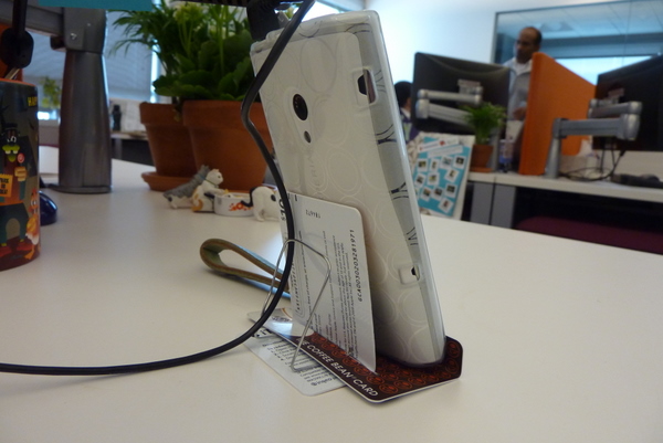
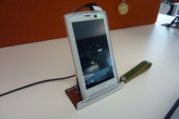
Inspired by my coworkers who had bent used gift-cards into phone stands, I decided to do the same. Unfortunately, I ran into some problems. My new Sony Ericsson Xperia X10 was a lot larger than their phones and due to the size and weight, their stand design did not accommodate mine. So, I set out to design one that would work for me and allow me to orient the phone in portrait and landscape mode.
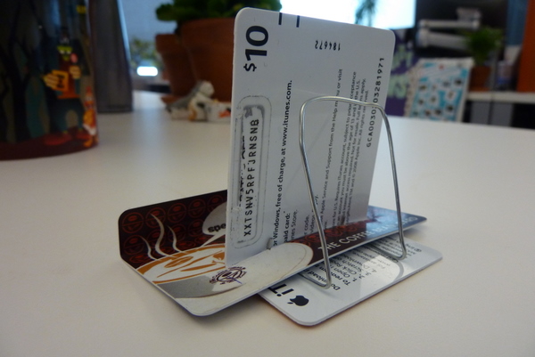
Here are some shots of the design. For the most part, this is a $0 Do-It-Yourself project assuming you already have the tools and some cards. I used some used iTunes and Coffee Bean gift cards. You could use old “credit/bank cards” but you should probably shred those. Anyways, you’ll need the following:
- Two used gift cards
- Paperclip
The cards alone aren’t enough since the device weight is too much for the cards. Thus, the paper clip is needed for added support and counterbalance. You will also need these tools.
- Needle nose pliers
- Xacto knife
- Cutting board
When folding the cards, you may or may not want to score the cards first so you have a straight line. Also, be aware that some cards bend and break easier than others so take your time.


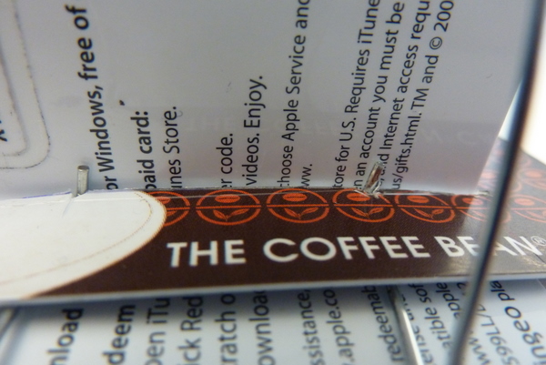
You’ll notice I made small notches by the slit to secure the paperclip. I may redesign the paper clip to hold the cable a little better.


For those who are curious, I’m using a right angle micro USB cable so that the cable doesn’t stick straight upwards. You can find it at Amazon: Startech.com 3FT Right Angle Micro USB Cable Is A Fully Rated USB Cable .
.
FWIW, we tested the stand with other phones and it’s compatible with the iPhone, Motorola Droid, and Nokia N97.
If you want exact measurements, leave me a comment and I’ll post “schematics”. I plan on making a few small upgrades like adding rubber nubs on the base. More updates to follow. Enjoy!
Enjoy!
May 11th, 2010
I’m nearly finished with a review of the Sony Ericsson Xperia X10 mobile phone but now comes word of a new firmware update that will fix some nagging issues people have been complaining about. I’ve been toying with releasing the review first but part of me wants to wait until the update is out so I can give a fairer review of the product. I’m leaning towards publishing sooner and then updating since I find the device to be usable now with no major downsides. More updates soon.
April 13th, 2010
I’ve neglected this site long enough and am in the process of refreshing the site. If you see any weirdness over the next couple of days don’t be alarmed. I’m incrementally changing the site style so that it’s more easily maintainable, higher performing, and visually appealing.
[update]
I’m getting close to finishing this. The search will come back in a different form but not too many people were using it anyways. The forum will take a little while to go through so bear with me. I think it will be for the best since most people didn’t seem to like the dark colors to begin with. There are some flourishes missing and the new logo is still in progress. I’m sort of on a typography exploration now and thus the experimentation. I’m keeping everything simple right now since I don’t have time for a full redesign but at least it’s less ugly.
September 16th, 2008
I finally pushed it out and have been adding little things here and there throughout the morning based on questions by others.
http://www.siliconpopculture.com/articles/review/sony_vaio_z/
Next up, I will be reviewing the docking station and the sleevecase I chose for it. I’m also starting my battery tests (may pickup an extended battery for comparison) so that will be a separate article. Stay tuned!
![]()
